Color Theory for Textile Designers: How to Master Palettes & Boost Creativity
Color Theory for Textiles
A Designer’s Guide to Mastering Color
As a textile designer, your color choices are paramount. Color theory isn't just art; it's a science that impacts emotional response, brand identity, and technical production.
This guide explores primary, secondary, and tertiary colors with textile-specific insights to empower your creative process.
of shoppers base clothing purchases on color alone.
This simple donut chart visualizes the significant impact of color on consumer purchasing decisions.
1. Primary Colors: The Foundation
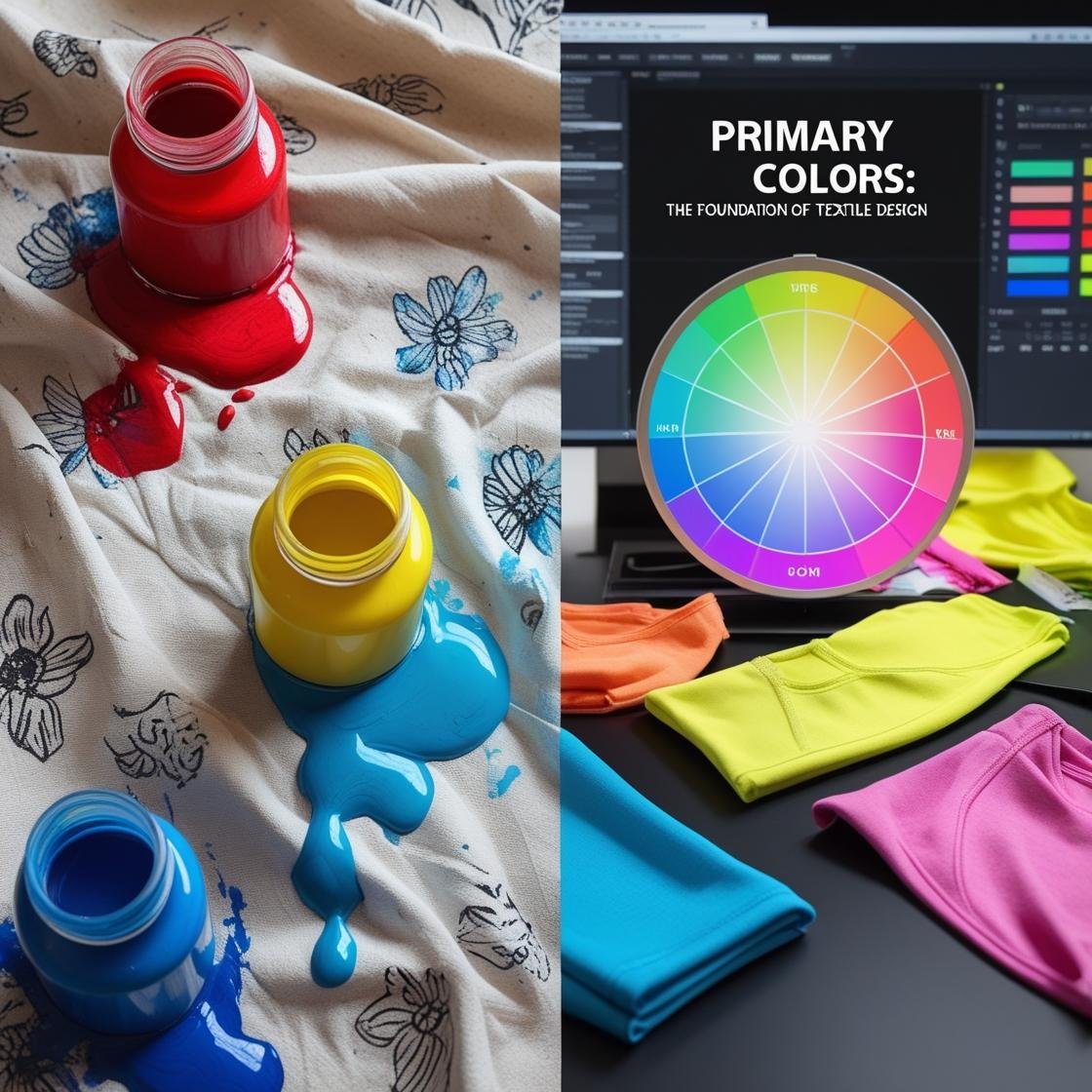
Primary colors are the bedrock of your palette – they cannot be created by mixing other colors. Understanding them is key for dyes, inks, and digital prints.
Traditional (RYB)
Used for dyes, paints, and hand-printing.
Red
Yellow
Blue
These are fundamental for physical color mixing in textile art.
Digital (CMYK)
Essential for digital fabric printing.
Cyan
Magenta
Yellow
Key
CMYK is crucial for achieving vibrant hues like neons in digitally printed activewear.
Textile-Specific Tips
- Avoid Muddy Mixes: Use pure pigments (e.g., Pthalo Blue for screen printing) for clear, vibrant results.
- Cultural Considerations: Be mindful of color symbolism. For example:
🧧 Red: Luck in many Asian cultures. ⚠️ Red: Danger/Warning in some Western contexts.
Researching cultural color associations for your target market is vital.
2. Secondary Colors: Bridging the Gap
Secondary colors are born from mixing two primary colors. They expand your palette significantly.
Mixing Secondary Colors (RYB Model)
Red + Yellow = Orange
Yellow + Blue = Green
Blue + Red = Purple
This visual shows how primary colors combine to create secondary hues, fundamental for dye mixing.
Applications in Fabric Design
Secondary colors help define the mood and target audience of textile products.
Pitfalls to Avoid
- Dye Inconsistencies: Always test dye mixes on scrap fabric first.
- Screen Printing vs. Digital: Secondary colors may shift between mediums. Proof carefully!
3. Tertiary Colors: The Secret to Sophistication
Tertiary colors are created by mixing a primary color with an adjacent secondary color, resulting in nuanced, sophisticated hues.
The 6 Tertiary Hues
Red-Orange
Yellow-Orange
Yellow-Green
Blue-Green (Teal)
Blue-Purple
Red-Purple
These swatches represent the six tertiary colors, which add complexity and depth to textile palettes.
Textile Design Applications
- Muted Tones: Dusty terra-cotta (Red-Orange) for bohemian styles.
- Balanced Palettes: Blue-Green (teal) in resort wear for calming vibes.
Tertiary colors are excellent for creating sophisticated and unique color stories in fabric collections.
Pro Tips for Using Tertiaries
- Pair with Neutrals: Use with charcoal gray, cream, or beige to avoid overwhelming prints.
- Gradients in Digital Prints: Perfect for sunset-inspired scarves or subtle ombré effects.
4. Step-by-Step: Building a Textile Color Palette
Creating a harmonious color palette is a systematic process. Here’s a simple approach:
Start with a Primary
Choose a base color (e.g., cobalt blue for nautical themes).
Add a Secondary
Introduce contrast (e.g., orange for pop art-inspired swimwear).
Accent with Tertiaries
Deepen complexity (e.g., blue-green for tropical prints).
Test for Harmony
🎨 Use Adobe Color or physical swatches under different lights.
This structured approach helps in developing a cohesive and appealing color palette for any textile project.
5. Case Study: From Theory to Fabric
A client needed a fall collection palette for sustainable linen, emphasizing earthy tones.
The Palette Solution:
- Primary: Mustard Yellow
- Secondary: Burnt Orange
- Tertiary: Yellow-Green (Moss)
This combination of primary, secondary, and tertiary colors created a warm, inviting, and cohesive fall palette.
Result:
Cohesive, earthy designs resonated strongly with the target market.
This case study highlights how strategic color choices, based on color theory, can directly lead to commercial success in textile design.
Conclusion & Next Steps
Primary, secondary, and tertiary colors are foundational tools to evoke emotion, tell stories, and drive innovation in your textile designs. Master them, and you'll unlock a new level of creative expression.
Free Download!
Grab your Textile Designer’s Color Mixing Cheat Sheet with RGB/CMYK codes, dye ratios, and Pantone equivalents!
Download Cheat Sheet (Link Placeholder)Ready to experiment?
Browse vector print libraries for pre-tested color palettes.Share your biggest color-mixing challenge or success story in the comments below!


